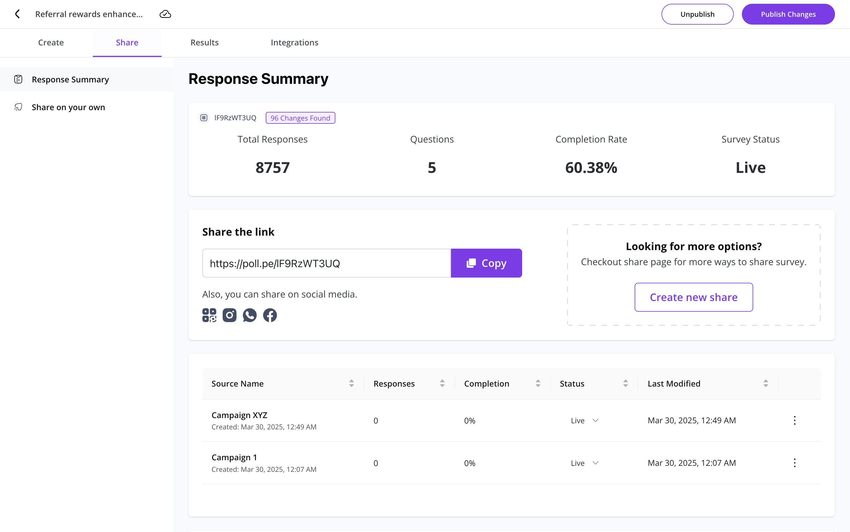
Survey Summary
PollPe's Survey Summary view gives you a visual overview of how respondents answered each question in your survey. These charts help you analyze trends quickly, especially for multiple choice, matrix, and open-text responses.
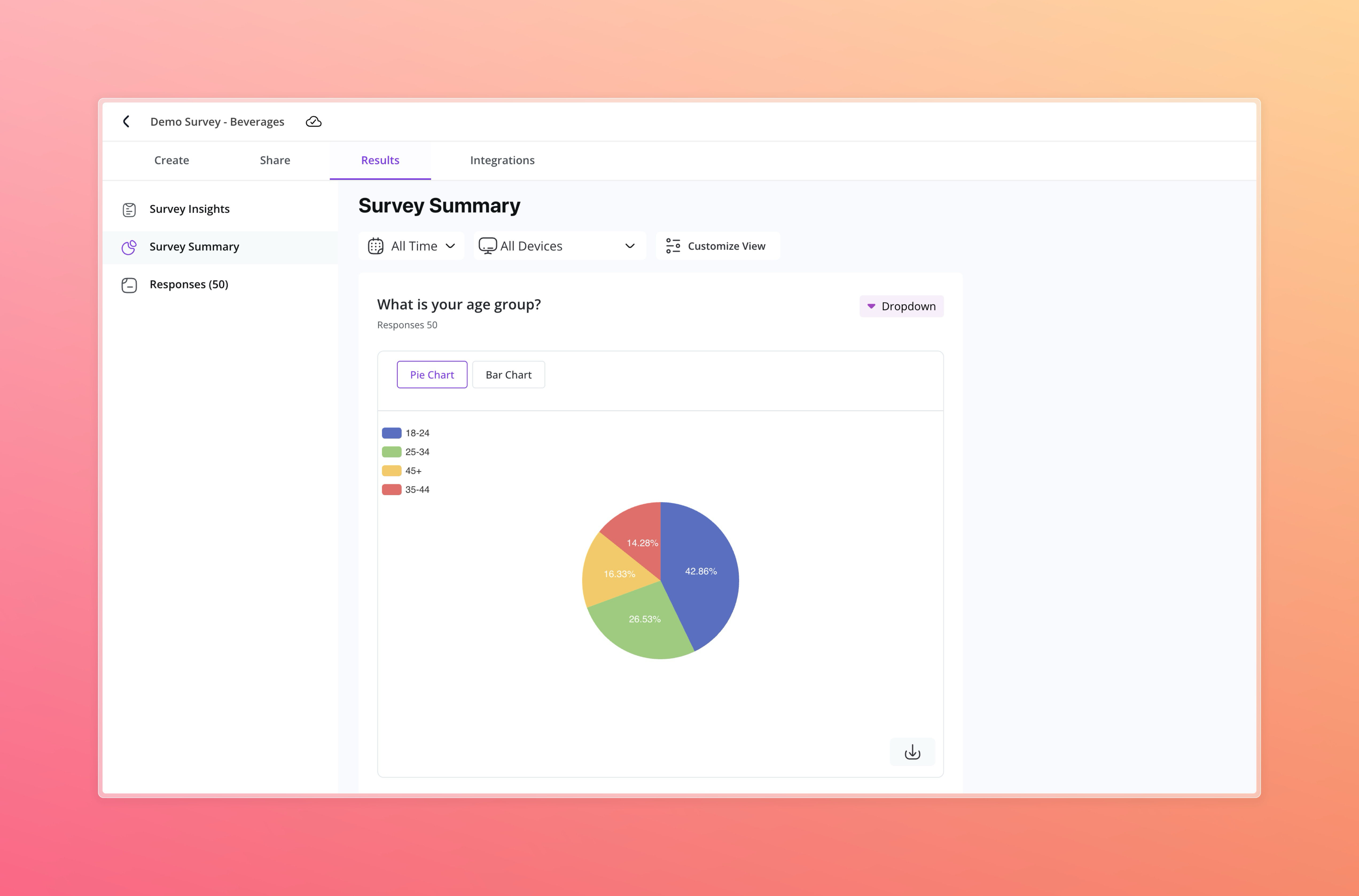
Chart & View Options
PollPe supports different chart types depending on the question format:
| Question Type | Visual Options |
|---|---|
| Contact Info | |
| Scrollable List (Email Values) | |
| Phone Number | Scrollable List (Phone Values) |
| Website | Scrollable List (URLs) |
| Choices | |
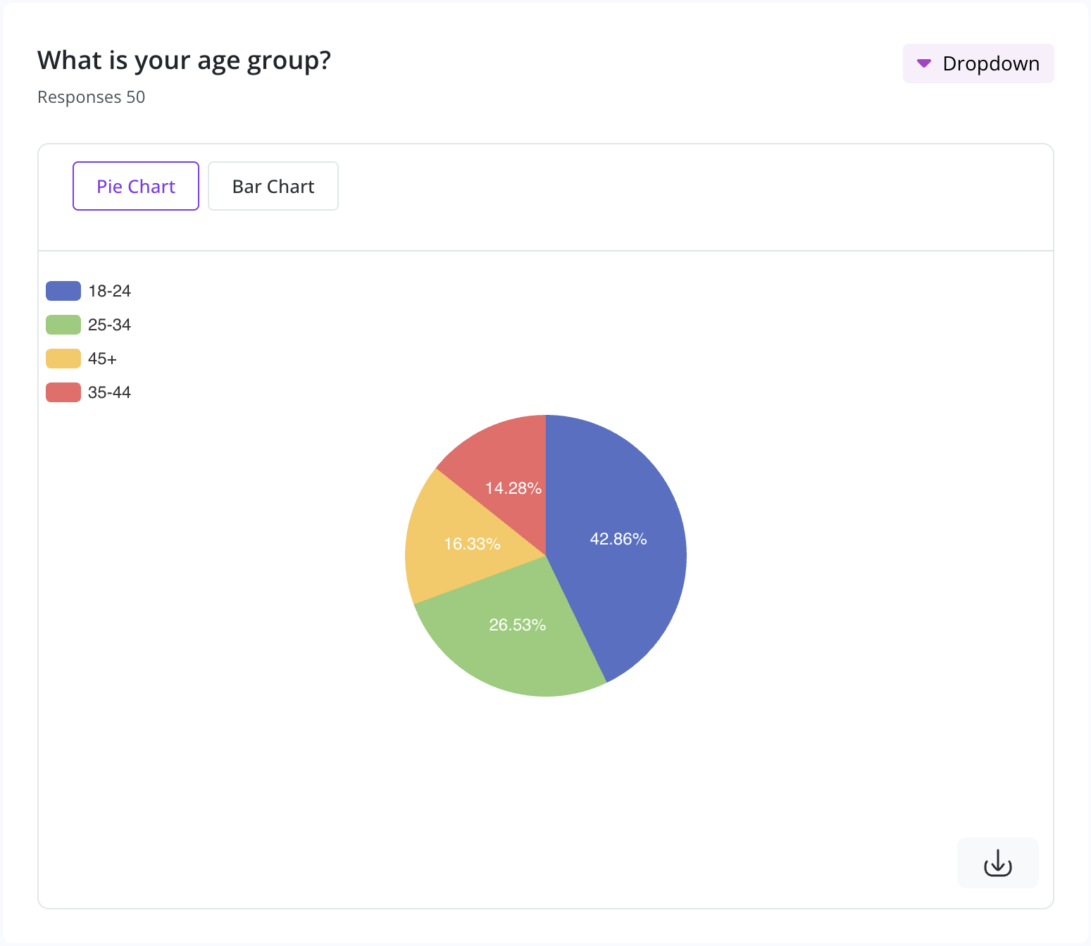
| Single Choice | Pie Chart, Bar Chart |
| Multiple Choice | Bar Chart |
| Dropdown | Pie Chart, Bar Chart |
| Picture Choice | Bar Chart |
| Yes/No | Pie Chart |
| Legal | Pie Chart |
| Rating & Ranking | |
| Net Promoter Score | Gauge Chart + NPS Breakdown |
| Opinion Scale | Gauge Chart, Bar Chart |
| Rating | Gauge Chart, Bar Chart |
| Matrix | Heat Map, Stacked Bar Chart |
| Ranking | Average Rank List, Breakdown |
| Text | |
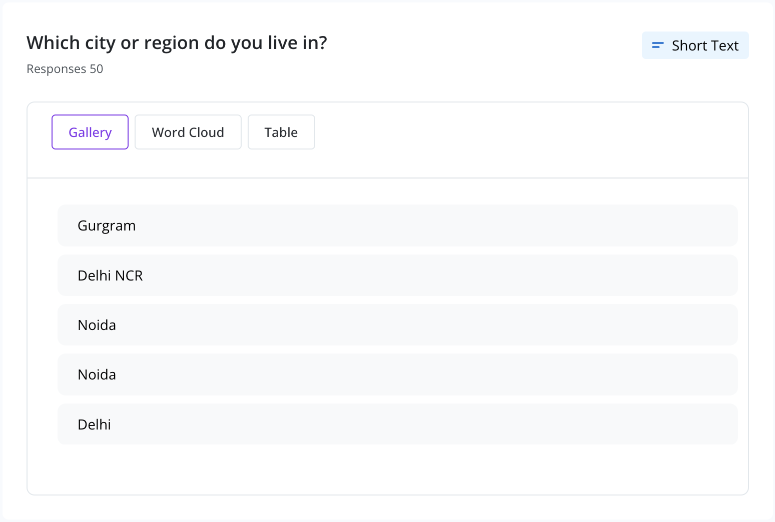
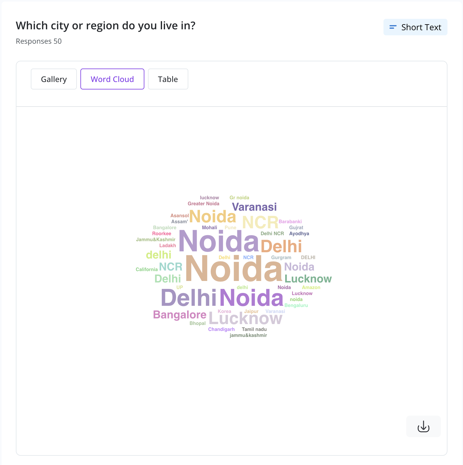
| Long Text | Gallery, Word Cloud, Table |
| Short Text | Gallery, Word Cloud, Table |
| Other | |
| Number | Histogram |
| Date | Scrollable List |
| File Upload | Scrollable List (File ID) |
| Take Photo | Scrollable List (File ID) |
Examples
Single Choice & Dropdown
A typical single choice/dropdown response is shown as a Pie Chart or Bar Chart. You can toggle between them.
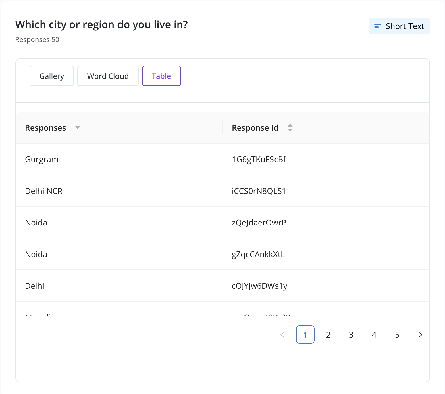
Short Text & Long Text
Text-based answers are displayed in three ways:
- Gallery View: Scroll through responses.
- Word Cloud: Popular keywords highlighted by frequency.
- Table View: With Response IDs.
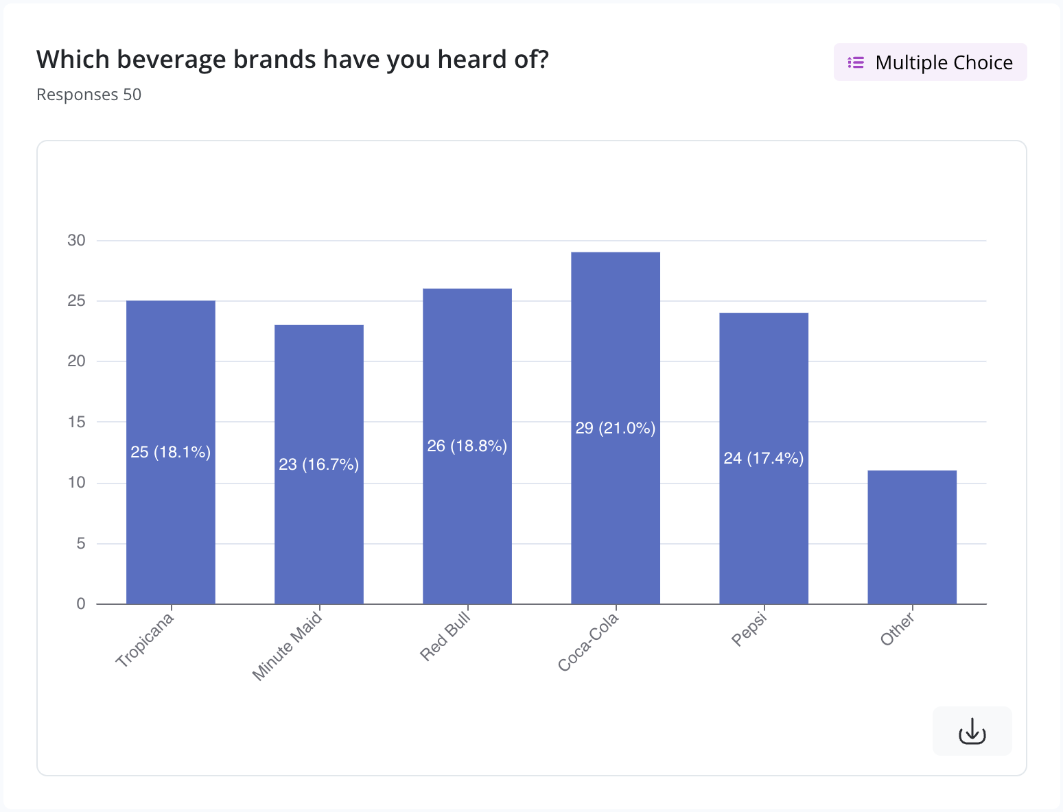
Multiple Choice (MCQ)
When users can select multiple options, a Bar Chart shows how many times each option was picked.
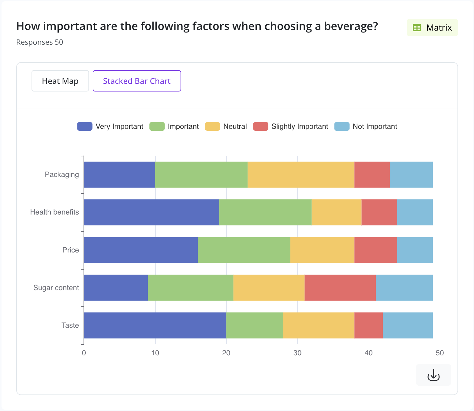
Matrix Question
Visualized using:
- Heat Map: Indicates response intensity by color.
- Stacked Bar Chart: Displays category-wise breakdown.

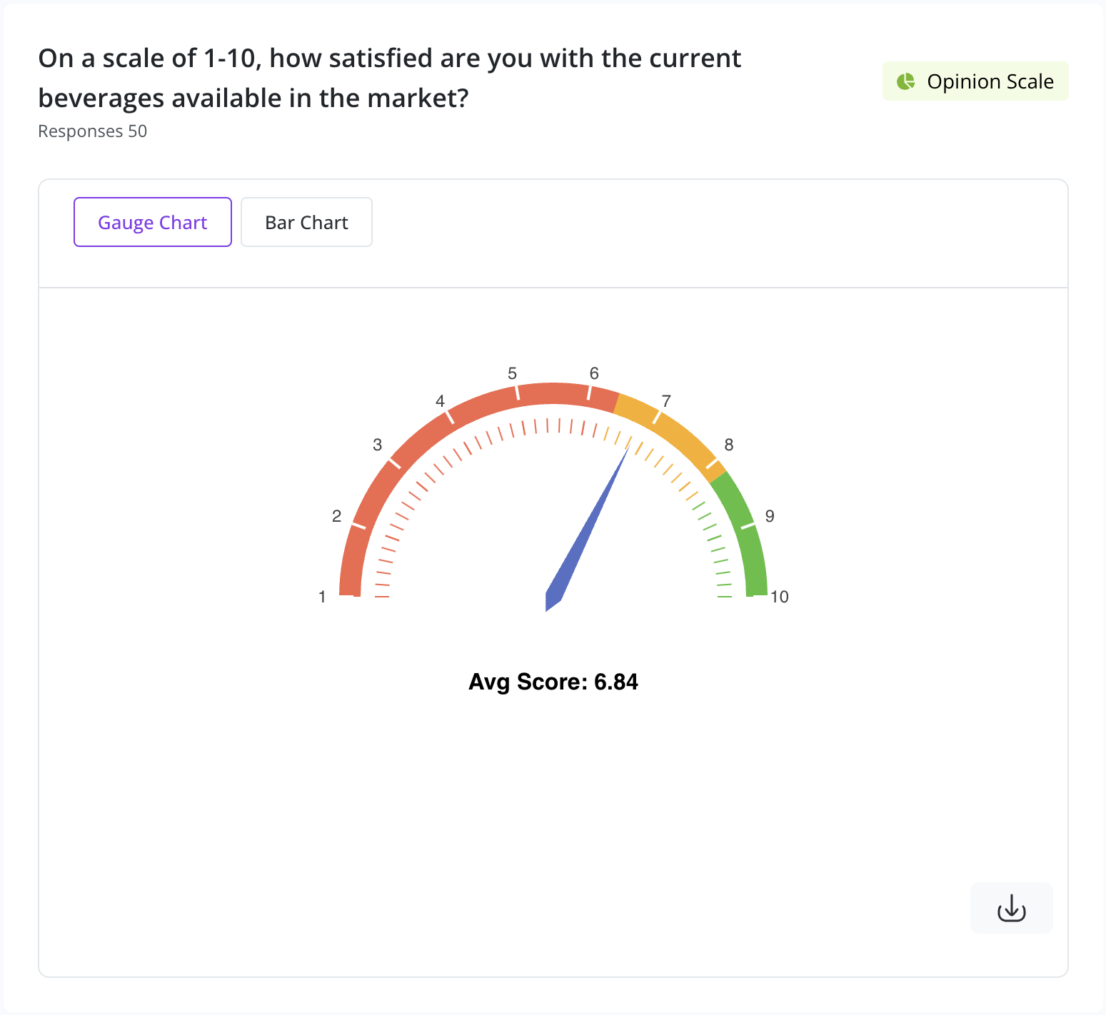
Opinion Scale & Rating
Opinion Scale & Rating questions are best represented using a Gauge Chart or Bar Chart. The average score is highlighted prominently.
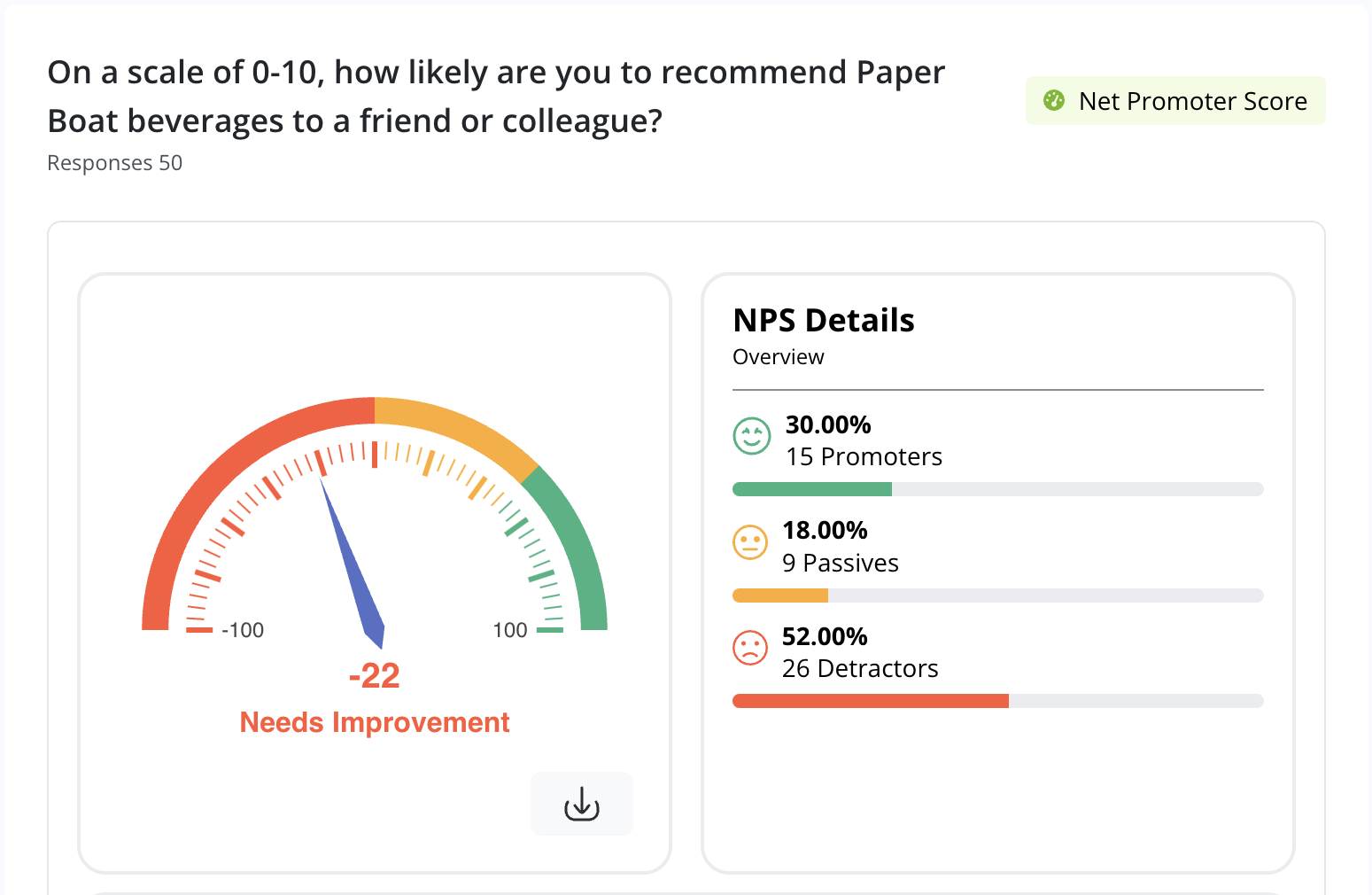
Net Promoter Score (NPS)
NPS results are shown using a Gauge Chart with additional Promoter-Passive-Detractor breakdown.
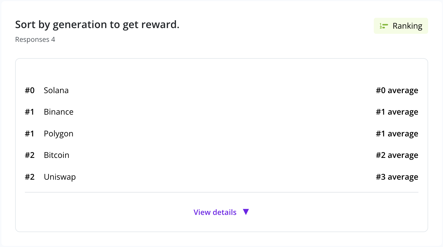
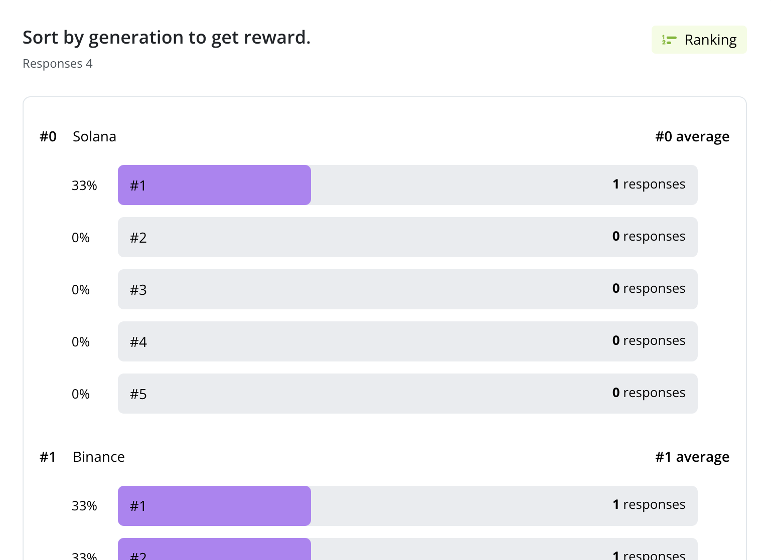
Ranking
Ranking questions are displayed using:
- Average Rank View: Shows the aggregated order across all respondents.
- Breakdown View: Explores how often each option appeared at each rank.
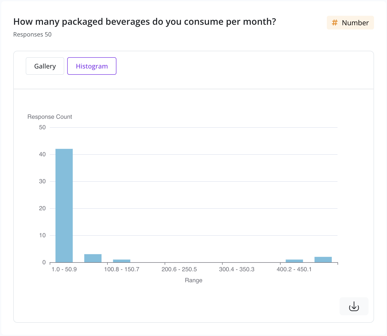
Number Question
Responses to numerical inputs are visualized using a Histogram for distribution analysis.
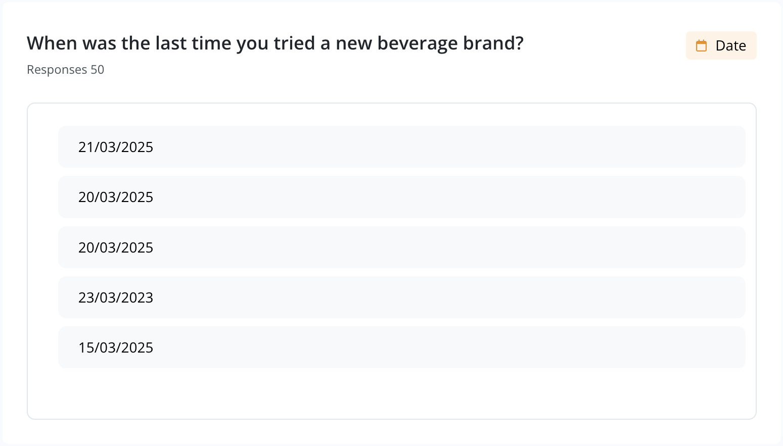
Date Question
Dates entered by respondents appear in a scrollable container, allowing you to browse through the timeline of responses.
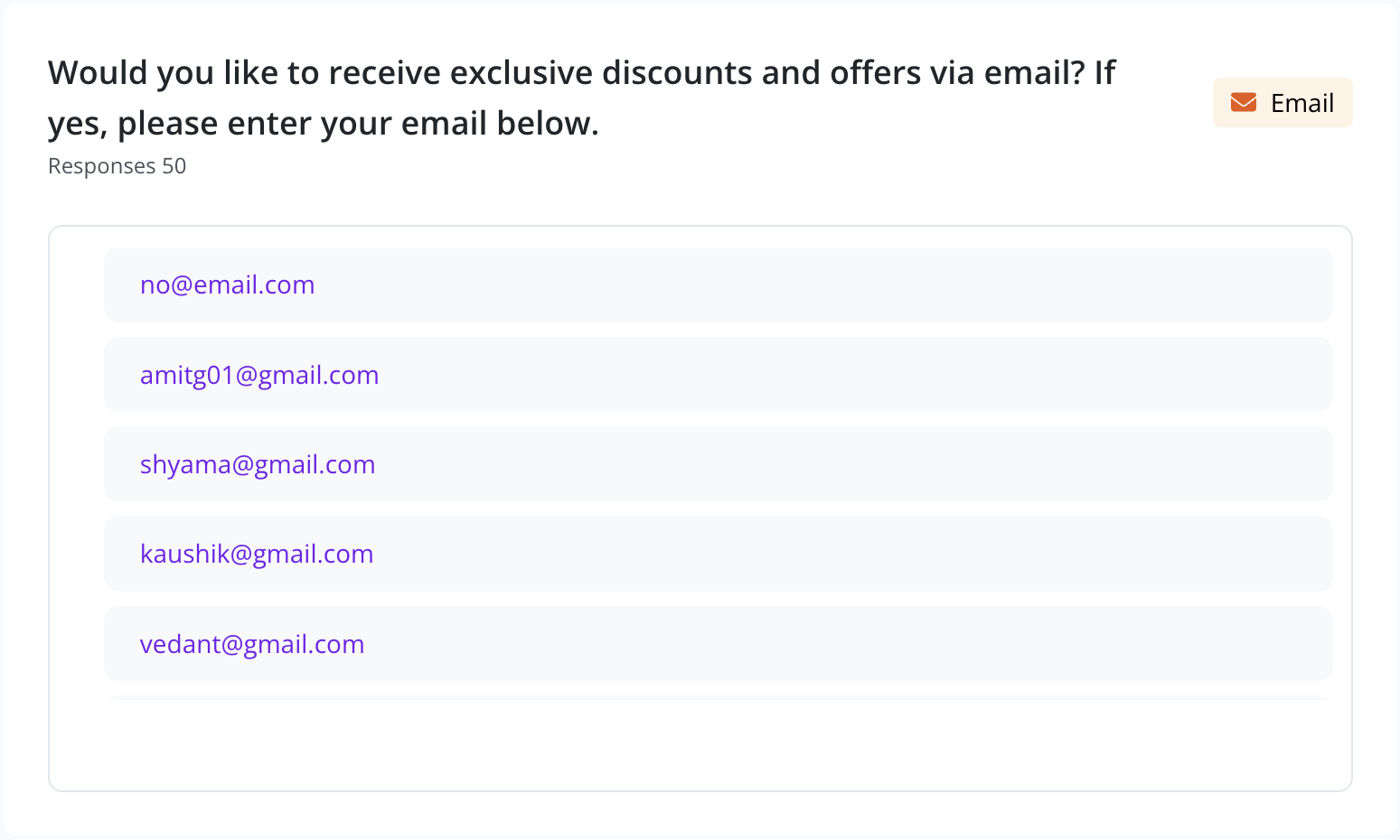
Email & Phone Number
Contact information (emails and phone numbers) collected through the survey are displayed in scrollable lists, allowing easy reference or export.
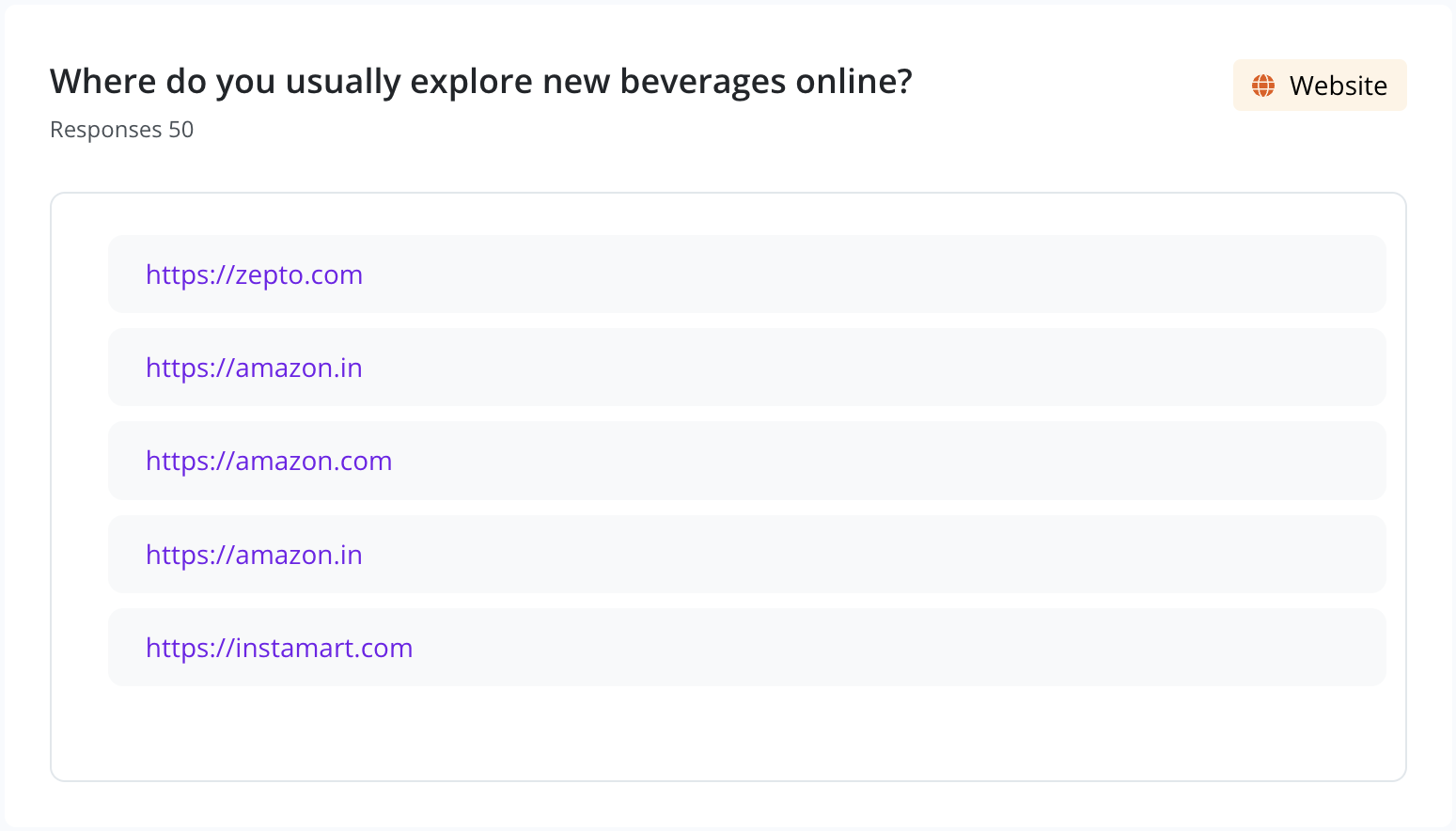
Website / URL Input
Website links shared by respondents are displayed in a scrollable container that you can navigate through to review all submitted URLs.
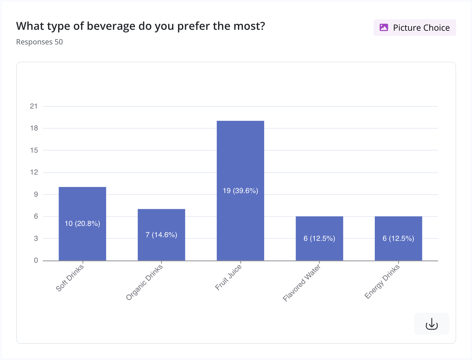
Picture Choice
When respondents select options with images, a bar chart shows the breakdown of image-based preferences.
File Upload
Uploaded files (images, PDFs, etc.) are shown in a scrollable format with unique file IDs.
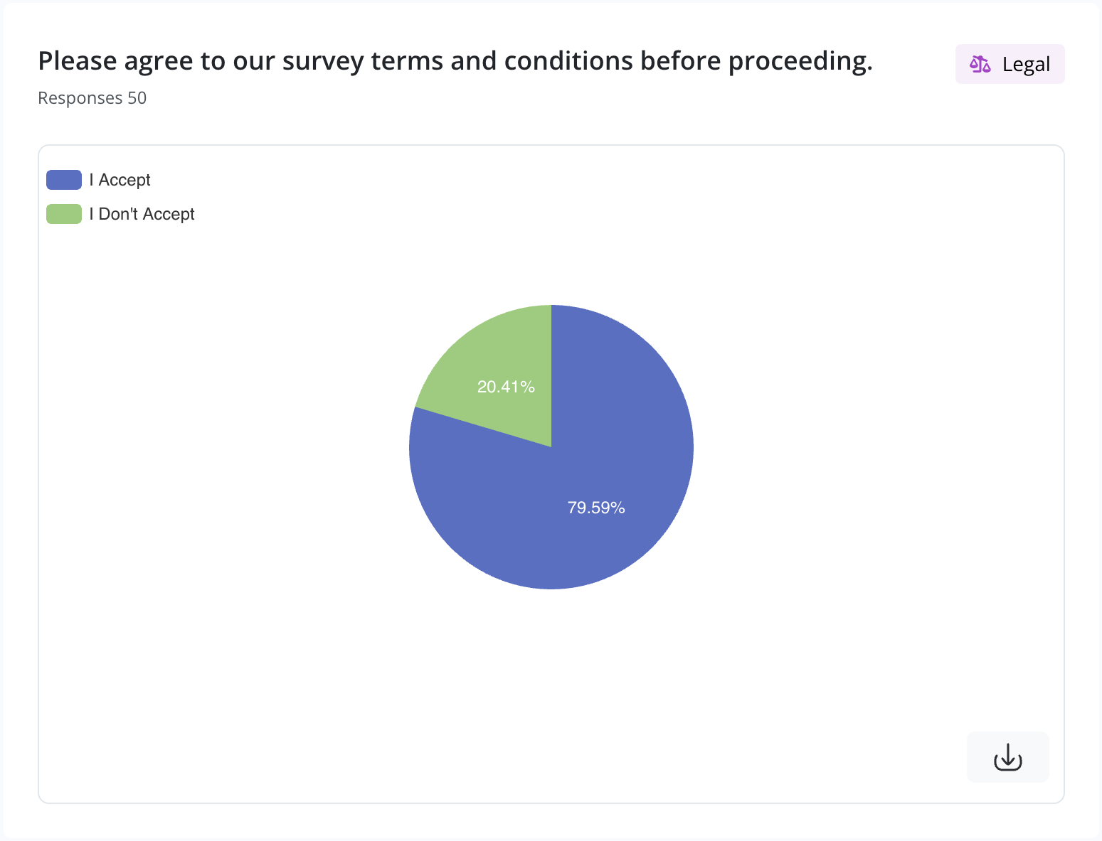
Legal / Consent
Legal questions like consent to terms are visualized with a Pie Chart, offering a quick view of acceptance ratio.
💡 Tip: You can also apply filters by time or device using the top controls.