Survey Themes
PollPe provides a range of predefined themes to quickly style your surveys with vibrant, professional, or minimal looks. These themes enhance the user experience and make your survey visually engaging.
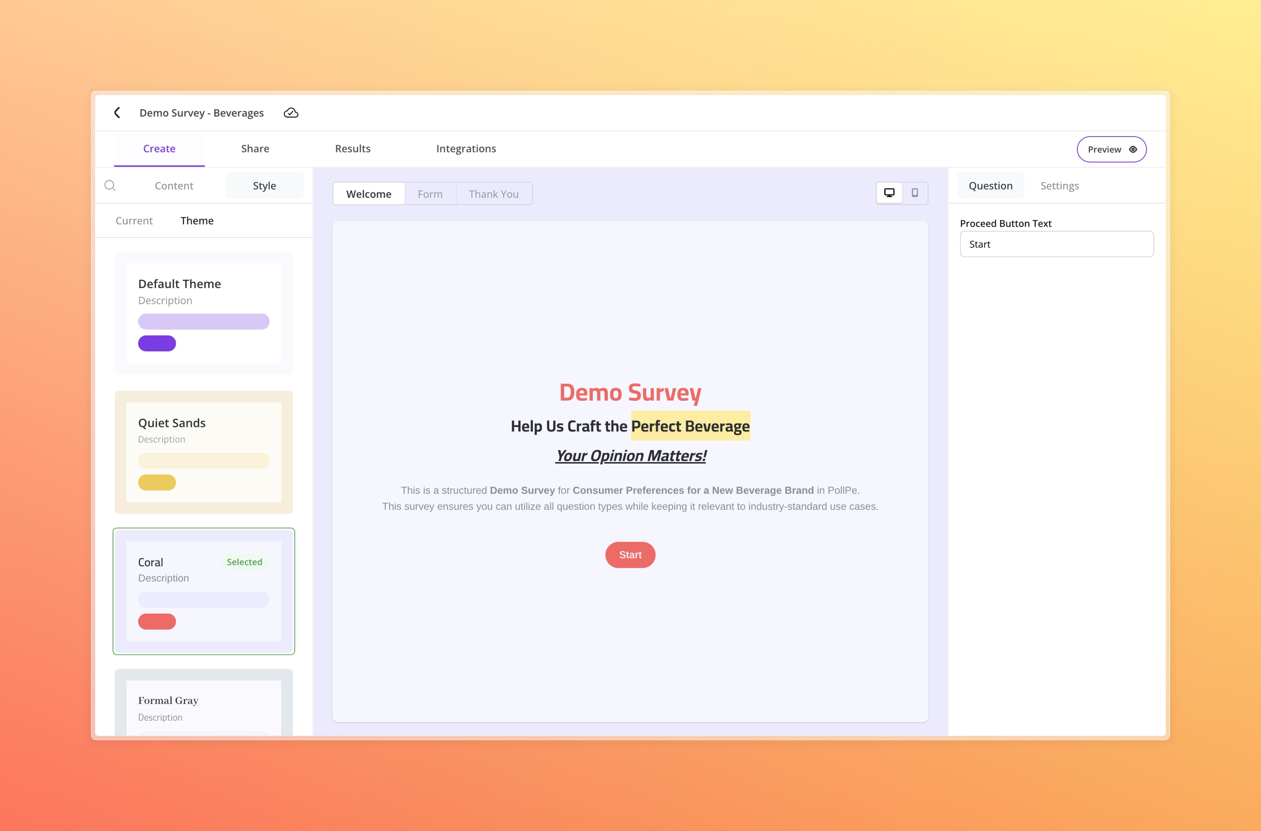
Applying a Predefined Theme
To apply a theme:
- Navigate to the Style tab while editing your survey.
- Select the Theme section.
- Choose from available themes such as:
- Default Theme
- Quiet Sands
- Coral
- Formal Gray
- Futuristic
- Neon
- Simple Purple
- Night Blue
The selected theme will be immediately reflected in the live preview and across all screens of your survey: Welcome, Questions, and Thank You screens.
Custom Theme Option
If you prefer more control, you can customize the theme by switching to the Current tab within the Style section. This allows you to modify colors, fonts, and other design elements to align precisely with your brand or survey tone. In the Current tab, you can update individual style elements such as Form, Layout, Question and Answer text, Placeholder, and Buttons—along with selecting Primary and Secondary fonts, adding a Logo, or enabling a Background Image. Checkout Adding Branding
Each theme includes consistent styling across the following elements:
- Form background
- Layout accents
- Question text color
- Answer text color
- Placeholder text color
- Button styles and color
- Primary Font
- Secondary Font
Themes help convey the mood of your survey—professional, playful, modern, or sleek—without requiring manual styling.
🎨 Note: Theme selection is global and cannot be customized per question at this time.